WESTFIELD PHYSICAL THERAPY

Redesigning the Change Engine to better complement user workflows

Text that states: "Role: UX Designer, UI Designer, UX Researcher"Text that states: "Timeframe: June to August 2024"Text that states: "Project: Kyndryl internship project"Text that states: "Tools used: Figma, FigJam, Miro"
What is the Change Engine?
At Kyndryl, I worked on a team of 5 to redesign the Change Engine.
The Change Engine is a proof-of-concept tool meant to provide a centralized hub of information regarding a project. Meant to get project managers and executives on the same track regarding progress on projects, the Change Engine gets everyone on the same page and ready to bring value to Kyndryl.
My job was to redesign the project description screen - the screen containing project information. This is the screen that project managers spend the most time tweaking so that they can present project updates during calls with executives.
BEFORE
"Before" screen of Change Engine.  Color scheme does not match brand guidelines and website content is cluttered and unclear..
AFTER
"After" screen of Change Engine. White space is increased,
During user interviews, I noticed that while executives held a consistently positive perception of the Change Engine, almost all project managers interviewed had multiple problems with the tool, including...
PROBLEM #1
The Change Engine did not complement users’ workflow
Lisa is a project manager in charge of a pioneering a bold new product.
To collaborate efficiently with her remote and in-person employees, Lisa opts to track project work on Jira, where work is updated in real-time and it is easy to assign and track responsibilities.
However, having to take the time to manually update the Change Engine every single time her team makes progress causes Lisa to feel stressed, frustrated, and burnt out.
Her frustrations echo in her progress reviews with her executive superiors, and create rifts in their professional relationships with one another.
“I’m wasting time updating the Change Engine, that I could be spending on doing actual work!”
SOLVING PROBLEM #1
Integrating Teams and adding the ability to import documents
Adding Teams to the Change Engine to automate a section of updates for project managers
BEFORE
Previously, all updates to the People section needed to be placed manually, with no way to contact individuals and no way to automatically validate whether or not contact information was updated.
AFTER
Now, the Teams integration allows for all employees collaborating on a project to be automatically updated and stored, without requiring validation or confirmation from the project manager. However, project managers still have the option to add or remove people manually.
Improving the Links section by adding imports (+ a notebook!)
BEFORE
Links were previously infrequently used, and there were no file upload integrations.
AFTER
The Links section is updated to include a file import functionality, with the option to update respective sections with the contents of said files. A notebook is also present for miscellaneous notes.
PROBLEM #2
Navigating the Change Engine is unclear and inconsistent.
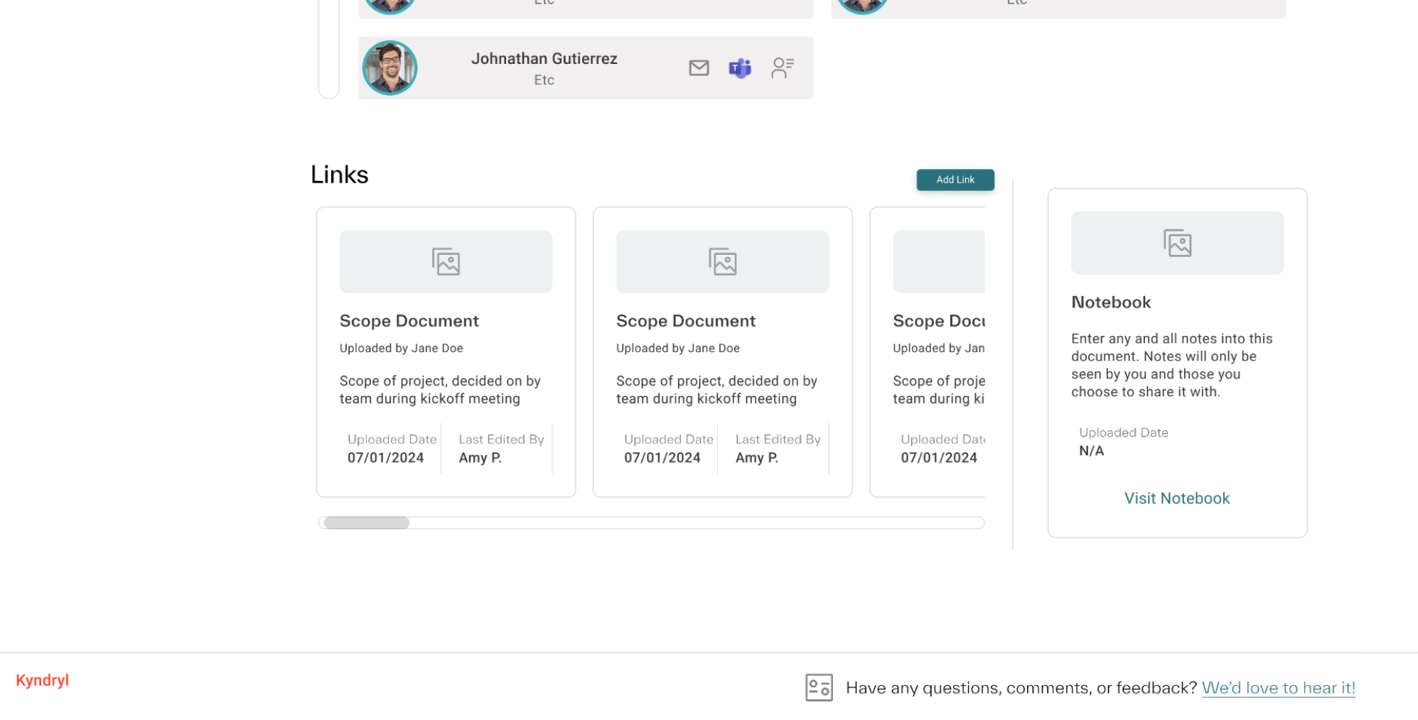
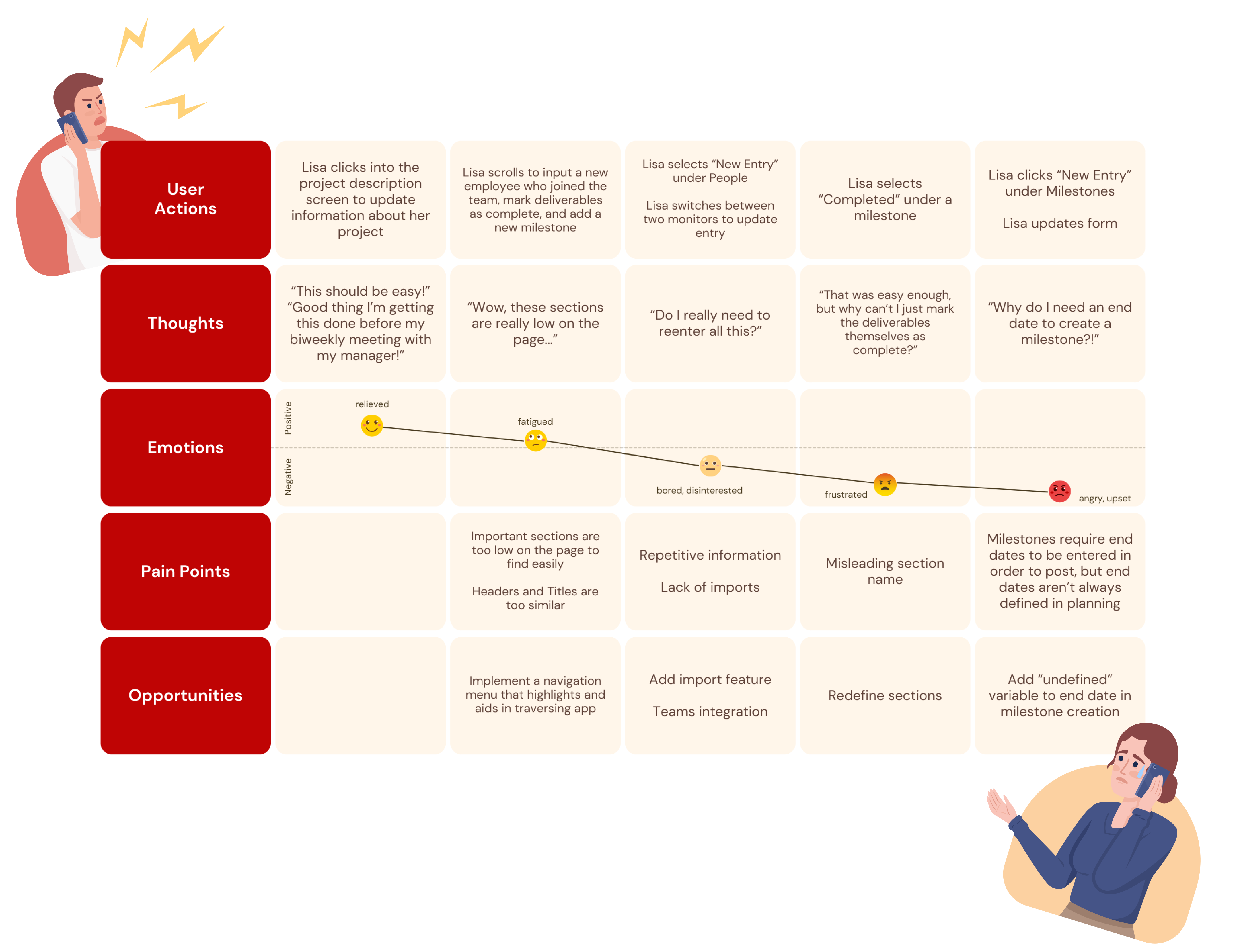
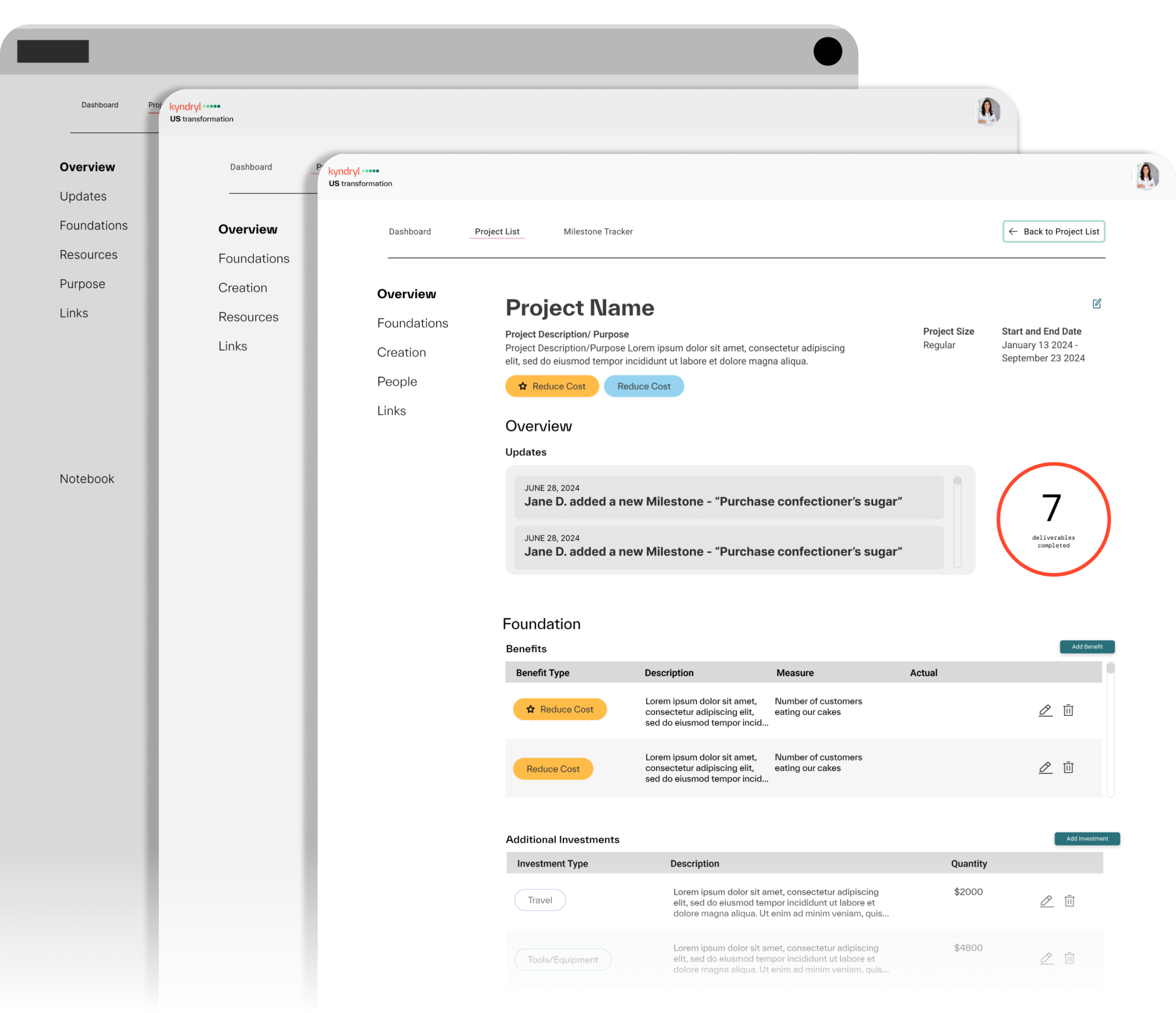
During usability testing, we noticed some users had filled certain sections of the Change Engine with information that had been intended to be placed somewhere else.
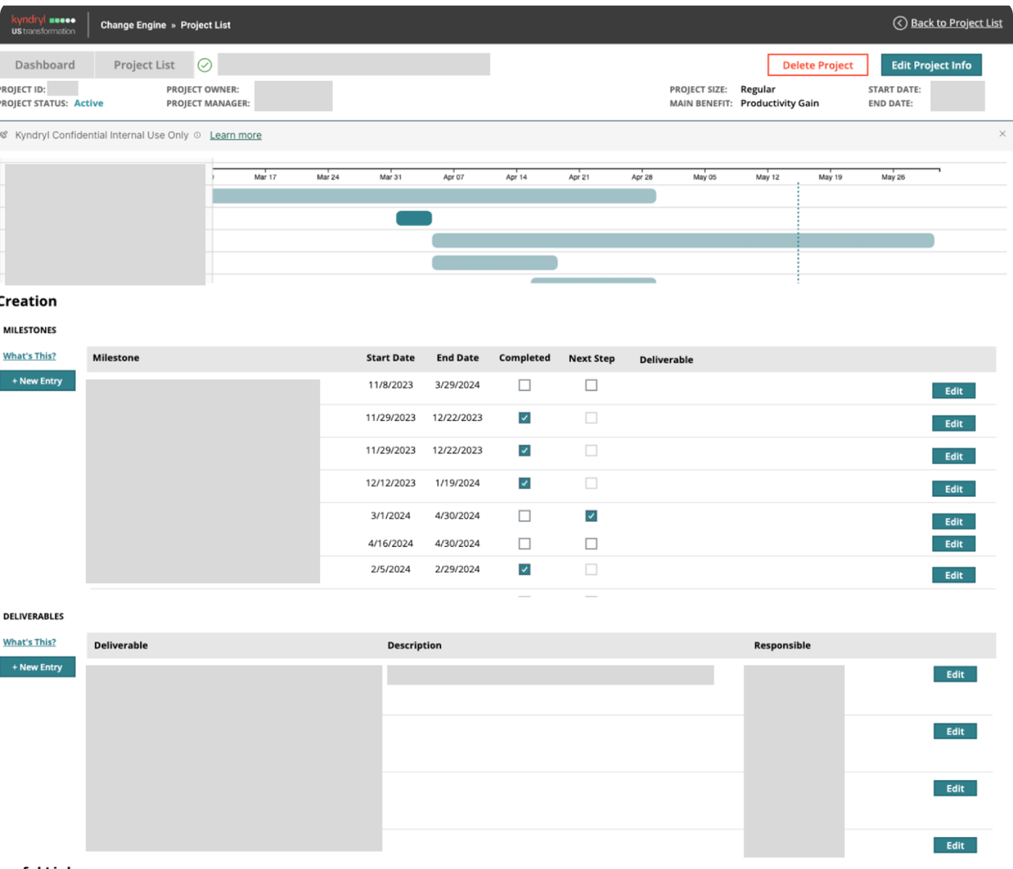
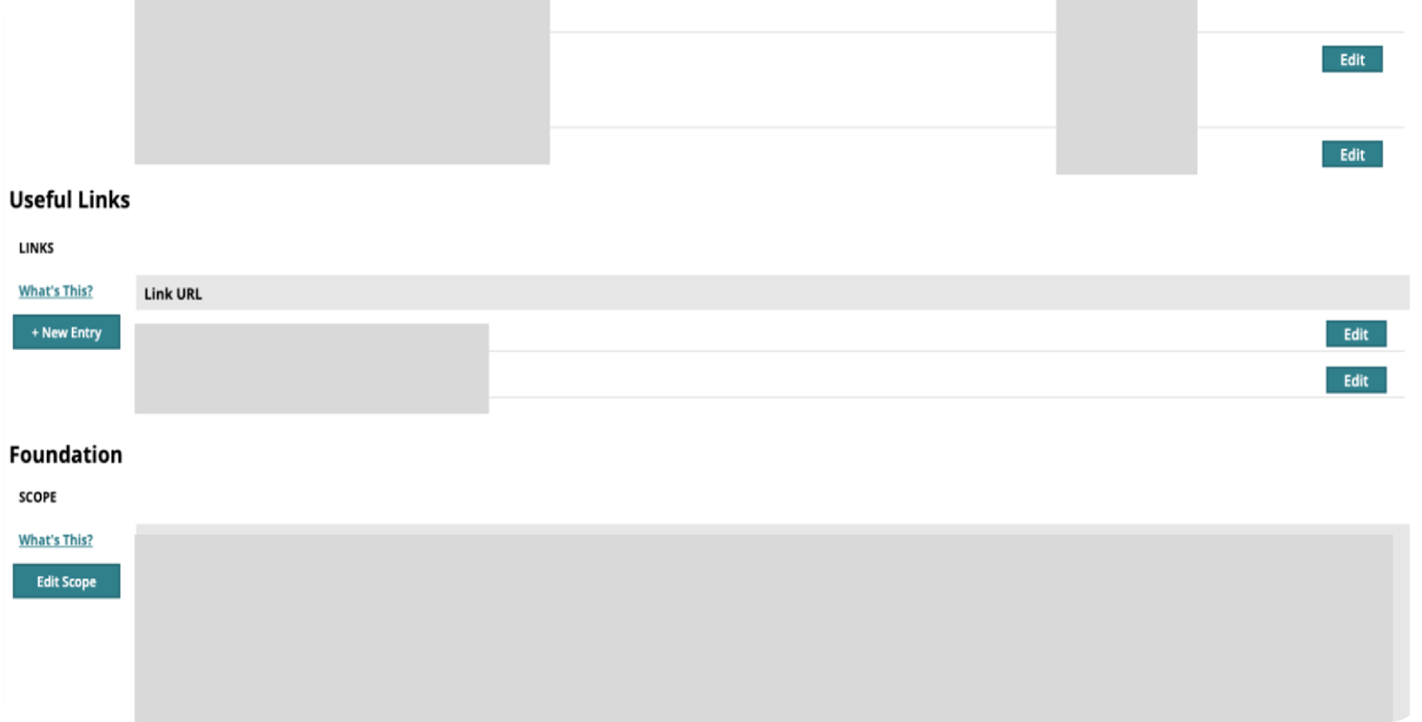
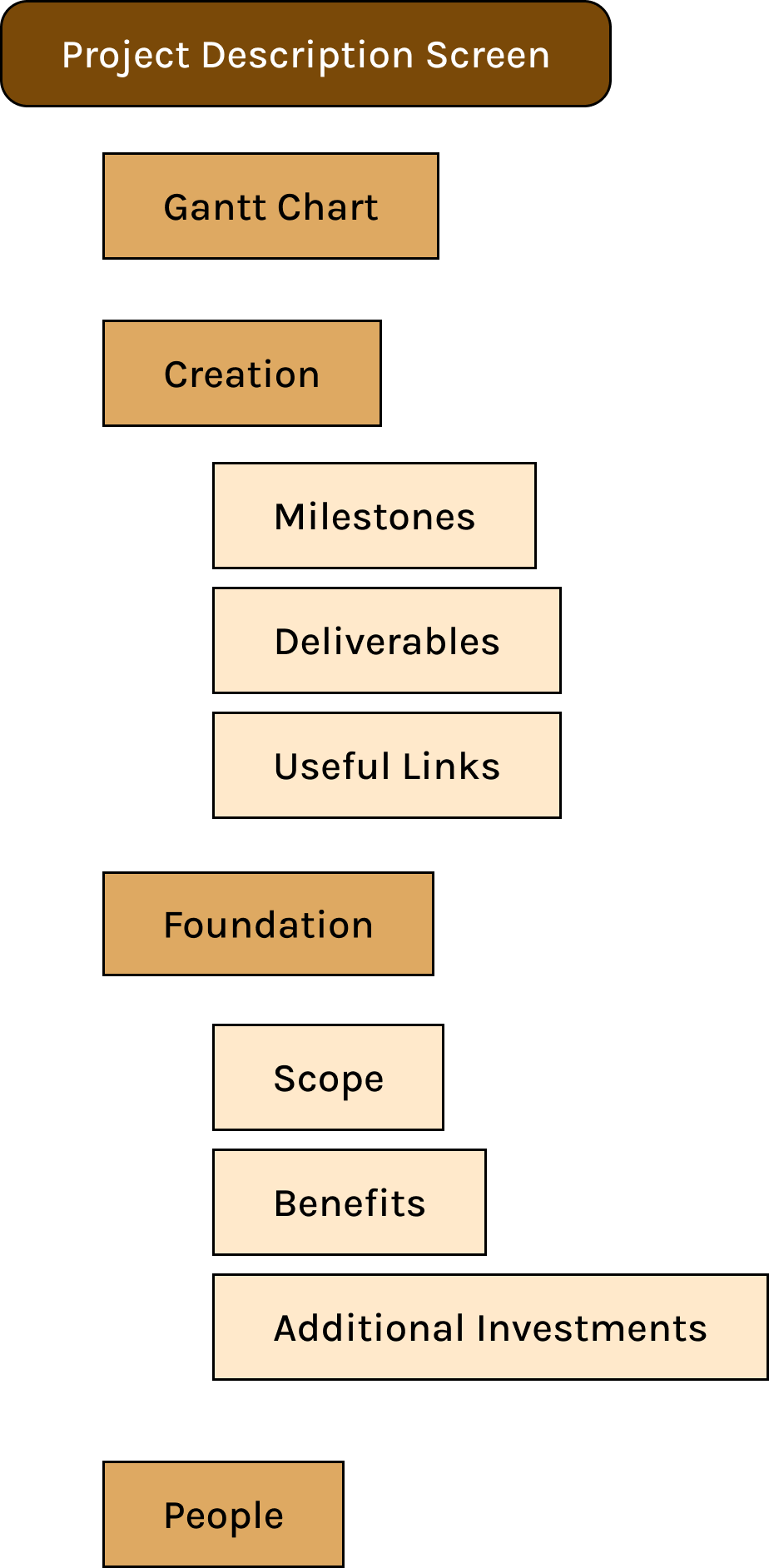
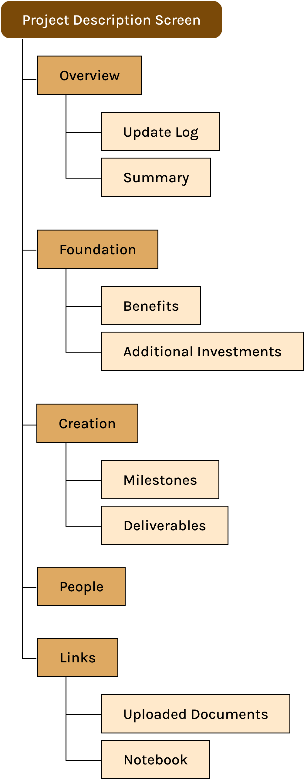
Many users found the order of creation vs. foundation to be confusing. Creation featured more of the mid-progress documentation and updates, such as milestones and deliverables, but its order in the information architecture led users to believe it contained foundational information.
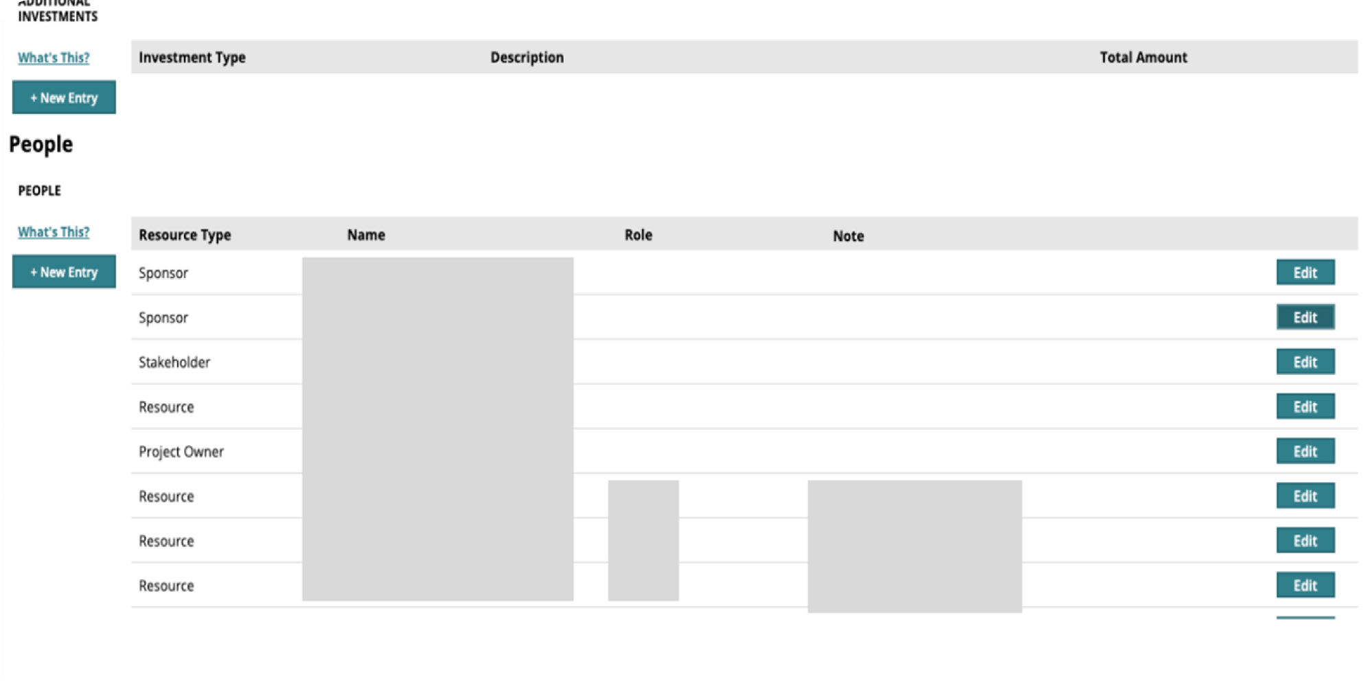
Additionally, important information such as Benefits were hidden deeper in the page, further increasing confusion.
The Change Engine’s information architecture prior to our redesign.
SOLVING PROBLEM #2
Reducing cognitive load with simplicity and added navigation
Adding a sticky navigation bar!
The addition of a sticky navigation bar allows the user to move anywhere on the page via clicking the header they’d like to scroll to, and always be aware of what section they’re currently on.
I reorganized the structure of the project description screen to be more intuitive and well-sorted. The most important/essential information is prioritized at the top of the screen, which also happens to be the information that typically requires the most manual effort (but can also be imported through uploaded documents).
I added an Update Log at the top along with a quick summary of the scope and project. This allows executives to get an immediate view of any new information and when it happened.
I also consolidated the Gantt Chart with the Milestones section. Users complained that they didn’t find the Gantt chart useful or important, and its structure seemed better equipped to fit the Milestones section’s true purpose as a projected timeline.
Revised information architecture. Content separated or renamed.
WHAT DID I TAKE AWAY FROM THIS EXPERIENCE?
Conclusions + Next Steps
NEXT STEPS
My team plans to present our redesigns to a board of executives and project managers, receive feedback via usability testing, and implement such feedback in future iterations of the tool.
WHAT HAVE I LEARNED FROM THIS REDESIGN?
Though initially I, like the executives, viewed the tool positively, this redesign emphasized how important it is to gain as much knowledge as possible about the users I am designing for. Putting aside my initial opinions required great empathy and communication skills, and I genuinely believe that this experience brought me miles ahead of where I was in terms of empathetic listening and collaboration.