WESTFIELD PHYSICAL THERAPY

Designing a website with multiple navigation options for those with impaired hand mobility

Role: UX Designer, UX Researcher, Squarespace DeveloperTimeframe: Aug 2023 to Jan 2024Project: Professional website designed and developed for Westfield Physical TherapyTools Used: Figma, Figjam, Squarespace
Older, Hispanic gentleman in front of a pottery kiln. He is smiling wide and appears very friendly.

This is Eduardo.

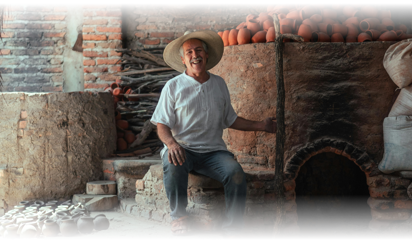
Eduardo is a 68 year old, retired man that’s deeply passionate about pottery.

However, as Eduardo ages, he struggles with wrist pain, impaired hand coordination, and worsening vision.

Eduardo's hands photographed in the process of pottery; he has thrown a piece of clay onto the wheel, and appears to be starting a new project

Worried about his pain, and hoping to preserve his ability to create pottery, his family encourages him to seek physical therapy.

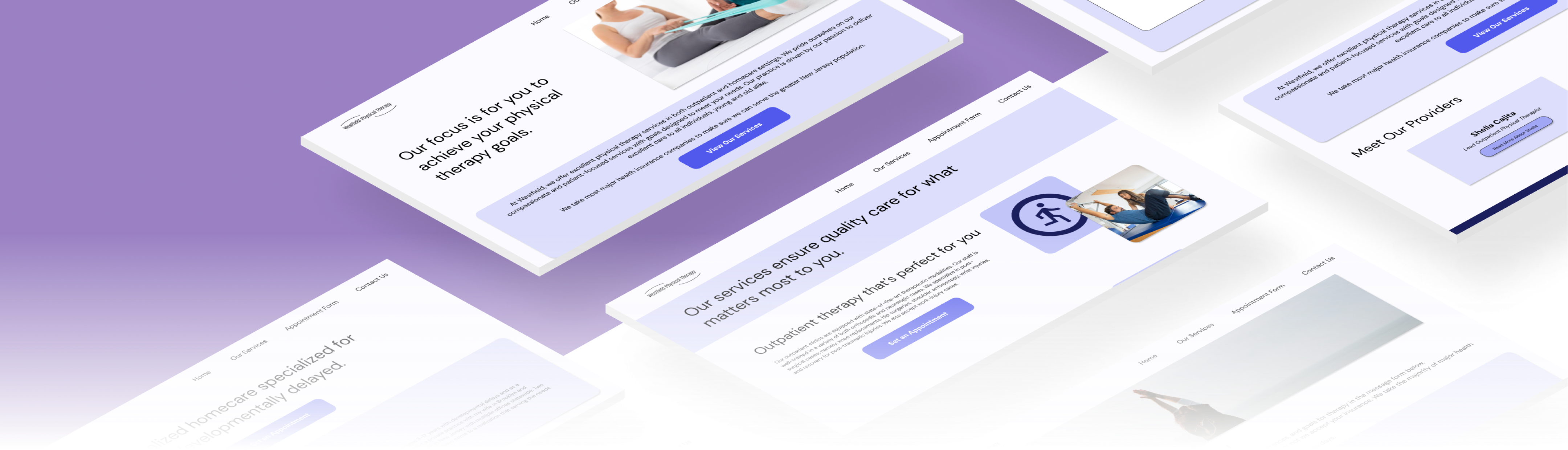
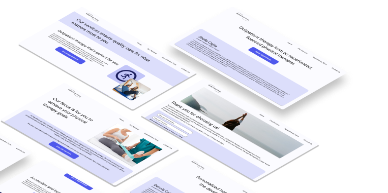
However, it is difficult for him to use small computer accessories such as mice or touchpads, and small-click targets such as hyperlinks discourage him from using the web to find a physical therapy clinic near him.

How can we design Westfield Physical Therapy’s website so that Eduardo isn’t entirely relying on mice and small click targets to navigate?

PRESENTING WESTFIELD PHYSICAL THERAPY
An accessible, easy to navigate website
Simplified information architecture
Right off the bat, Westfield Physical Therapy’s website is simple, with very few click targets per page. It’s easy to know where you need to go, and how to get there.
GIF file of user interacting with all pages and buttons of Westfield's website.
Laptop mockup of Westfield's homepage
Entirely navigable via keyboard
For users like Eduardo, a website only navigable by mouse might prove inaccessible. Westfield Physical Therapy’s website is entirely navigable by both mouse and keyboard to improve accessibility for as many users as possible.
Large click targets with WCAG approved contrast
Sometimes, users struggle to see certain elements when they are small or contain colors that do not contrast well enough against each other. Westfield Physical Therapy’s website contains large click targets that contrast strongly against the website’s background, with text that is approved by WCAG to ensure accessibility.
Image depicting contrast statistics across Westfield's design system elements. Contrast is at least 5.23 across the board
This website increased Westfield Physical Therapy's call conversions by a whopping 40%!

How did I do it? Let's break it down:
RESEARCH
Understanding the digital pain points of physical therapy patients
Before I could start designing Westfield Physical Therapy’s website, I ran into an issue:
The company was new, and lacked the budget to fund interviews or user research. How could I design a website without conducting research on the user group?
Performing qualitative research to understand the bigger picture
Determined to understand the users, I spoke to the lead physical therapists and owners of Westfield to get a better understanding of their target demographic. From there, I also performed in-depth qualitative research into statistical papers and scholarly articles. Below are my findings:
Finding #1
The majority of physical therapy patients in the United States are over the age of 65.
Finding #2
73% of users over the age of 65 in the United States identify as needing assistance with technology.

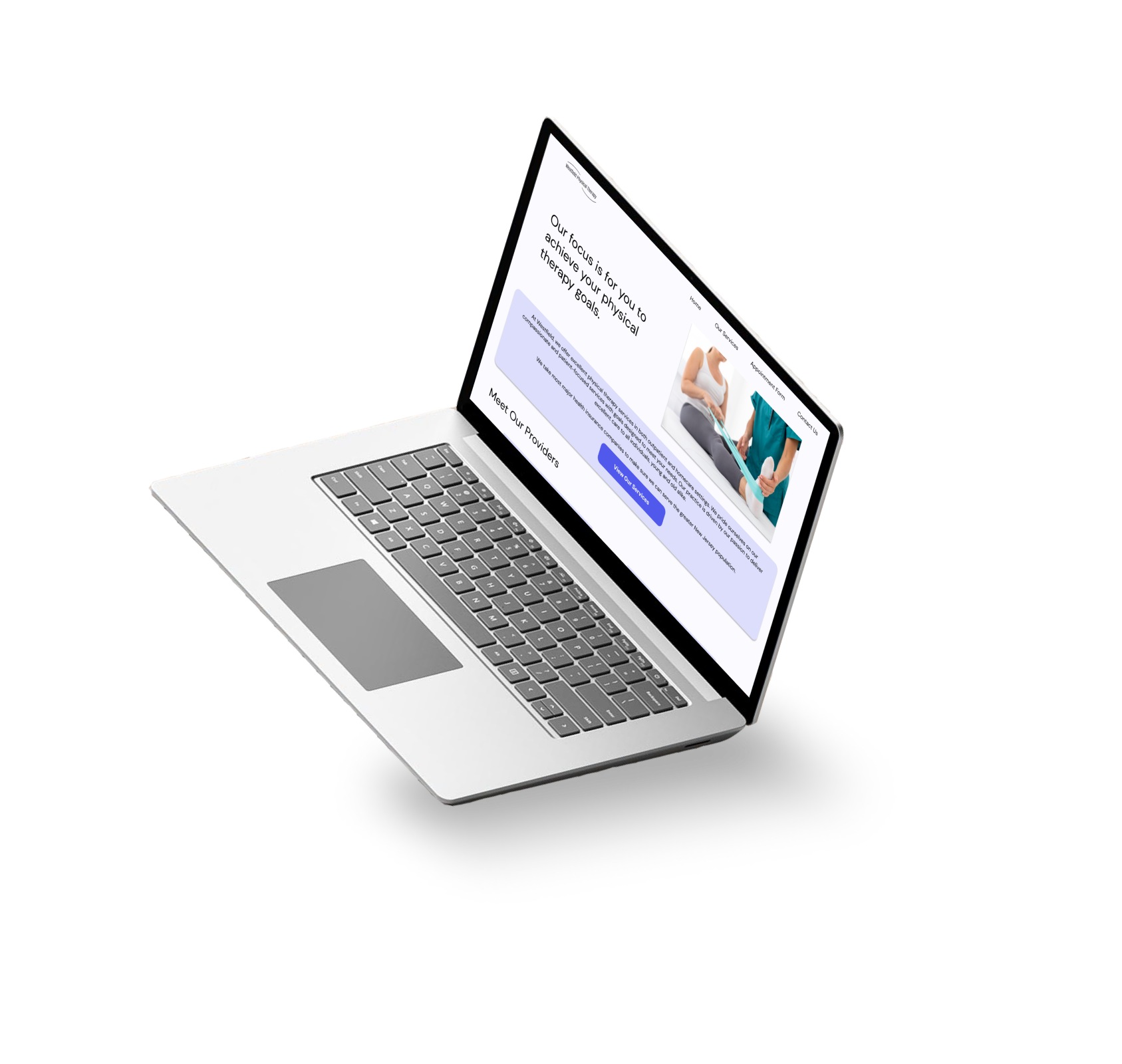
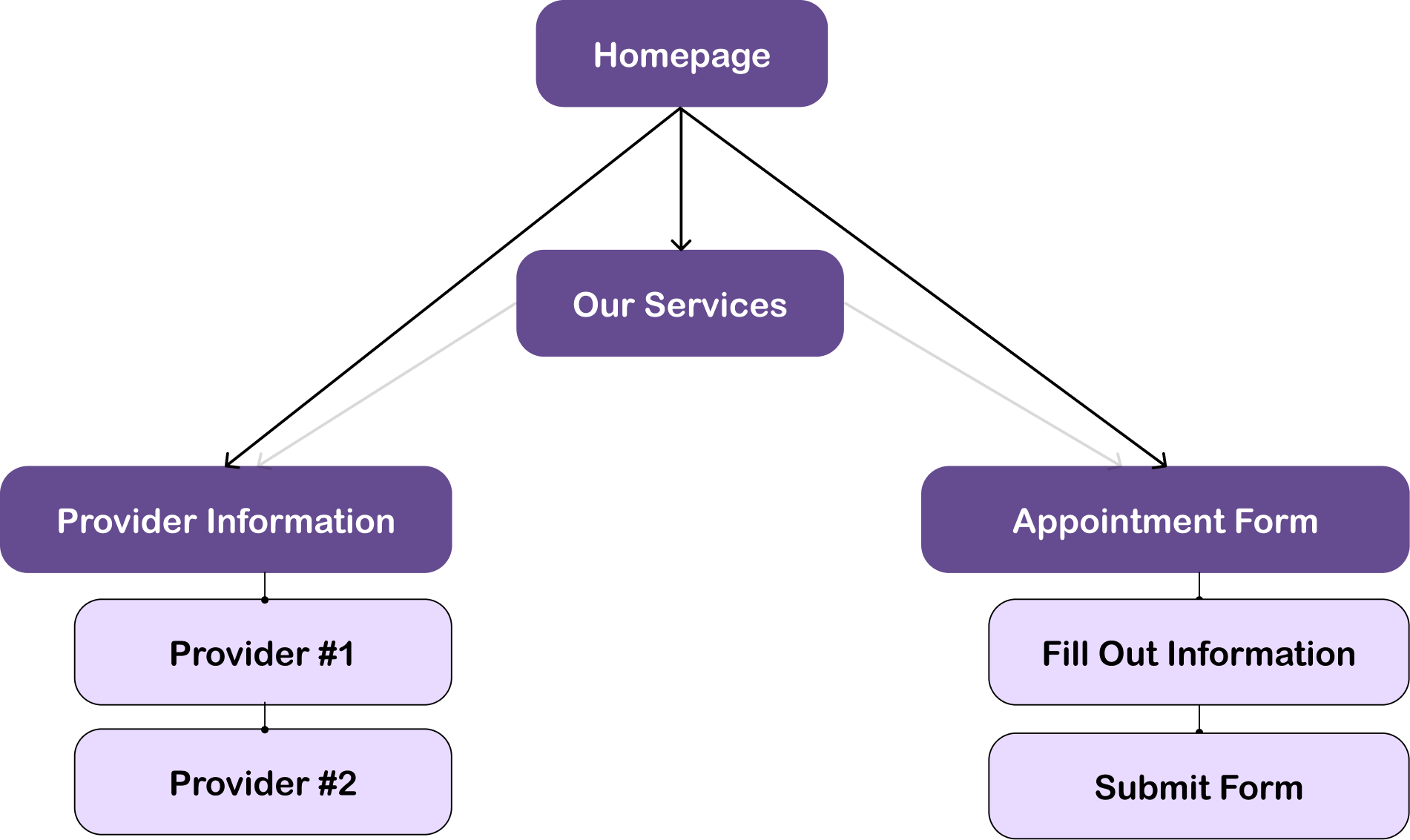
After performing research regarding the demographic, I then narrowed my research into analyzing the pain points they experience.

Finding #3
Major usability issues for individuals over the age of 65 include small click-targets, information overload, and difficulty using small non-ergonomic computer accessories (i.e., computer mouse, touchpad).
DESIGN
Designing with simplicity and accessibility at the forefront
Information architecture of page.  The homepage leads to Our Services, Provider Info, and Appointment Form.
Westfield Physical Therapy’s information architecture - since we prioritized simplicity, we wanted to minimize the amount of information and ensure multiple ways to access different pages
After working out the information architecture with the clients, I moved onto developing the brand identity.

Healthcare and calm emotions are associated with the color blue, so I made sure that was the primary color assigned to the website.

Additionally, Westfield Physical Therapy’s primary company colors are shades of indigo and purple, so I made sure to include those within the color scheme as well.
Design system for Westfield. Shades of blue and purple are prominent.
Interact with the Final Prototype!
WHAT HAVE I LEARNED?
Conclusion and takeaways
This was my first professional, user experience design based project! Though I’ve worked for Westfield in 2020 to develop their website, it was definitely more web development based than UX design based. Here are some reflections:
COMMUNICATING, SUPPORTING, AND DESIGNING WITH A CLIENT DIFFERENT FROM MYSELF
One of my biggest highlights from this experience was being able to help my client achieve their creative vision. Originally, the only ask of the website was that it existed! But through discussion and collaboration, we were able to come up with a vision for the website - together.
Westfield Physical Therapy is an immigrant-owned small physical therapy clinic dedicated to helping those with developmental delays, and the owners have little experience with web development or design. Having previous experience with developing a website, and now equipped with a Google UX Design certification, I was able to explain the limitations and possibilities available to my client, and work with them to produce a holistic, calming, and accessible experience to properly reflect their mission. Not only that, but through collaboration, I learned immensely about my client’s ideals, values, strengths, and purpose for starting a physical therapy clinic in the first place.
Through this collaboration, I developed a newfound appreciation for professional communication, teamwork, and empathy.
WHAT WOULD I DO IF I COULD REVISIT THIS PROJECT?
Now that the company is a bit more stable, I would perform usability testing to iterate on the existing design.
Though I am proud of my work considering the lack of a budget, one of my greatest wishes regarding this project was to do more in-depth user research. I wish I could have performed interviews to understand the 65+ demographic, which is underrepresented in the digital space. That way, I might have uncovered some deeper pain points that users like Eduardo would experience.